They say 1 image is equal to 1000 words, but in real life, without written words, a lot of things have no meaning at all whether it was a book, website, or an advertisement…etc., here the need for typography is created to maintain a good content look with other design elements.
How Old the Term Typography is?
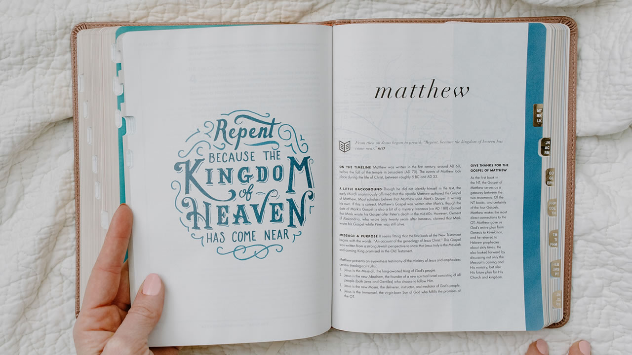
Starting from old religious books typography was used to give holiness to the word of the Holy Bible, and even before that it was used by the past nations on their temple’s walls, our grandfathers knew the importance of typography in their life and we continue on their invention to our modern tools and digital products.
So, what is Typography?
it is the art of working with text by arranging and shaping the letters and text in a way that makes them able to copy, clear to read, and give visual impact on their uses to the reader or viewer.
Good Typography Create Branding
Unique shapes of letters and text might stick in the mind of the client, and he/she will recognize it every time he/she sees it as the text related to the first time product he/she saw on these letters or text, you might already have in your mind some brands names letters shapes, like Mcdonald’s, Rayban, or Aramex to name a few.

If you noticed the brands I mentioned here are all in the red background but you still recognize them at first look, even a child can tell what these logos represent. This is the power of typography.
Good typography makes the difference between someone staying on your website for a minute or half an hour.
What is the Maximum Number of Fonts in any Good Typography Design?
Typography can be a hard term for you but as a beginner, it is as easy as it can using the recommended number of fonts that you can use which is 2 fonts, but the maximum number is 3 fonts, you mainly need a font for the title and a font for the text, but some designer uses the typeface of the fonts or font sizes to apply a subheading font and some designers use a third different font. It is up to the designer to determine which approach he/she will use, but as a design rule, it is not more than 3 fonts in every single design. But always look for other designs for inspiration of combining fonts with each other, and there are so many websites that provide free creative font styles for commercial use such as www.fontsquirrel.com.
Important Typography Terms Every Designer Should Know
1) Font:
A font is the name said to be the shape of the letters of a collection of letters. Like serif, san serif, Verdana…etc.
2) typeface:
A typeface is the type of font in terms of weight and type like the font types: light, regular, bold, italic…etc.
3) Hierarchy:
Hierarchy is the guide that the reader’s eye goes to whatever is read first then next. In other words, using different levels of emphasis like size and weight, and type.
4) Leading:
Leading is known as line spacing in the web design world. which is the space between lines of text
5) Tracking:
Tracking is known in the graphic design world as character spacing, which is the overall space across one word.
6) Kerning:

Kerning is the space between specific characters. Unlike tracking, it varies over one word because each letter fits together differently.
7) Alignment:
Alignment is the side to which the text is aligned, for example, in web design, there are 4 types of text-align which are: left, right, center, and justify.
Conclusion
typography is fundamental to us as designers, no matter what project you’re working on you need to have a basic understanding of typography, and in this article we mention the most important topics of typography, if you have any other questions please write us a comment.
posted by Emad Zedan on 31 Dec 2022 in Design, Project Management, UX/UI Design, Web Design