In today’s mobile-dominant world, websites need to be as adaptable as a yoga master – effortlessly adjusting to any screen size. Responsive web design (RWD) is the key to achieving this fluidity, but it requires precise control over the units used in your CSS code. Here’s where the “rem,” a champion among relative units, swoops in to save the day!
What is rem and why is it the Responsive Web Design Champion?
Unlike pixels (px) that are fixed in size, rem stands for “root em” It’s a relative unit that takes its size cue from the font size of the document’s root element (often the html tag). By default, most browsers set this root font size to 16px, so 1rem translates to 16px.
Here’s why rem is the ultimate teammate for responsive web design:
- Scaling Made Easy: When you define font sizes and other styles using rem, you establish a baseline that scales proportionally. Increase the root font size in media queries (targeted CSS styles based on screen size) for larger screens, and all rem-based elements adjust accordingly, maintaining a visually pleasing layout.
- Flexibility and Long-Term Love: rem makes global font size changes a breeze. No more manually adjusting every element – a lifesaver for accessibility, as users can zoom in without messing up your website’s structure.
- Lean, Mean, CSS Machine: Replacing px with rem throughout your CSS can significantly shrink file size, leading to faster loading times – a win for everyone!
Getting Started with rem: Your Responsive Web Design Toolkit
Setting the Base Font: In your CSS, define the font size for the <html> element. A common starting point is 16px, but feel free to customize it based on your design.
html {
  font-size: 16px;
}
rem is Your New Best Friend: Ditch px and embrace rem for font sizes, paddings, margins, and other properties. Here’s how it looks in action, aligned with Bootstrap 5.3.x media queries:
body {
  font-size: 1rem; /* Inherits from the root element */
}

h1 {
  font-size: 2.5rem; /* Adjust as needed for your design */
}

@media (min-width: 576px) {
  /* Applies to small devices (landscape phones, tablets) */
  body {
    font-size: 1.1rem; /* Slightly larger font size for small screens */
  }
}

@media all and (min-width: 577px) and (max-width: 768px) {
  /* Applies to medium devices (tablets) */
  body {
    font-size: 1.2rem; /* Can further adjust font size for medium screens */
  }
}

@media all and (min-width: 769px) and (max-width: 992px) {
  /* Applies to large devices (desktops) */
  body {
    font-size: 1.3rem; /* Customize font size for larger screens */
  }
}

@media all and (min-width: 993px) and (max-width: 1200px) {
  /* Applies to extra large devices (large desktops) */
  body {
    font-size: 1.4rem; /* You can adjust font size for extra large screens */
  }
}

@media all and (min-width: 1201px) and (max-width: 1400px) {
  /* Applies to extra extra large devices (very large desktops) */
  body {
    font-size: 1.5rem; /* Optional adjustment for very large screens */
  }
}
Pro Tips for rem Mastery in Responsive Web Design
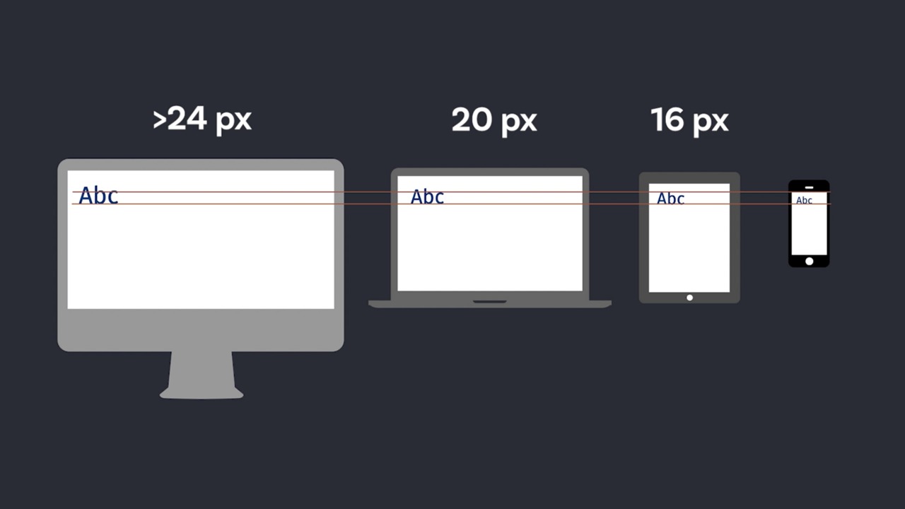
- Media Queries: The Dynamic Duo: For even finer control over responsiveness, use media queries to adjust the root font size at different screen breakpoints. This ensures elements scale perfectly across various devices.
- Beware of Nesting Mischief: While rem is fantastic, excessive nesting of elements using rem can lead to unintended consequences. If your rem values get deeply nested, consider using percentages or a mix of units for better maintainability.
- Reset and Conquer: A reset stylesheet helps normalize browser defaults and ensures consistent font sizes across different browsers. This can be particularly beneficial when working with rem
rem vs. em: Choosing Your Responsive Weapon
rem is the go-to choice for global styles and maintaining consistency throughout your website. However, there are situations where em might be more suitable. For example, if you want an element’s font size to scale relative to its parent element’s font size (rather than the document’s root element), using em would be the right call.
By understanding the strengths of both rem and em, you can make informed decisions to achieve optimal responsiveness in your web designs.
Conclusion
Mastering the rem unit unlocks a world of responsive web design possibilities. By embracing this powerful tool and leveraging media queries, you can create websites that adapt seamlessly to any screen size, delivering an exceptional user experience on all devices. So, ditch the fixed pixels and embrace the flexibility and maintainability that rem offers. With a little practice, you’ll be crafting responsive websites that not only look great but also provide a user-friendly experience for everyone.
Bonus Tip: Consider a CSS Preprocessor
For larger projects, using a CSS preprocessor like Sass or Less can streamline your workflow. These tools allow you to define variables for your base font size and easily create reusable mixins for common styles like paddings and margins, all based on rems. This can save you time and ensure consistency across your entire codebase.
Embrace the Power of rem!
By incorporating rem into your responsive design strategy, you’ll be well on your way to creating websites that not only look stunning but also provide a seamless user experience across all devices. So, what are you waiting for? Start using rem today and see the responsive magic unfold!
posted by Emad Zedan on 09 Jun 2024 in Coding, Design, Development, UX/UI Design, Web Design, WordPress